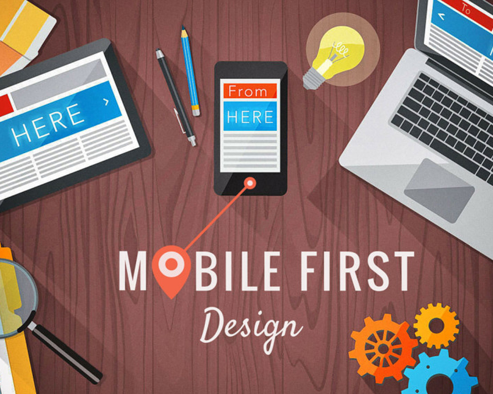
For the past five years, mobile has dominated desktop as the most popular form of digital media access. For the year 2017, the number of mobile users was 4.7 billion and 58.9% of those users used their mobile to access the internet. That’s nearly 2.7 billion people that are using the internet on their phones. That number alone proves the importance of designing webpages that function optimally on mobile devices. There are two main approaches to accomplishing this – Mobile First and Responsive Web Design.
Mobile first and responsive web design (RWD) are huge buzz words in the web design world. But, are they actually different things or is responsive design just a way to help you create a mobile first design? Graceful degradation used to be the norm, meaning that designers created for the newest and biggest device, and the smaller, older devices got the leftovers. The new norm is progressive enhancement, which means starting the project at the bottom and working your way up. More people use mobile devices today than they ever have before, so now the mobile view of a site is never placed on the back-burner or last round of testing.
This SlideShare explores in brief how a Mobile First approach can help businesses.

